
The challenge
01
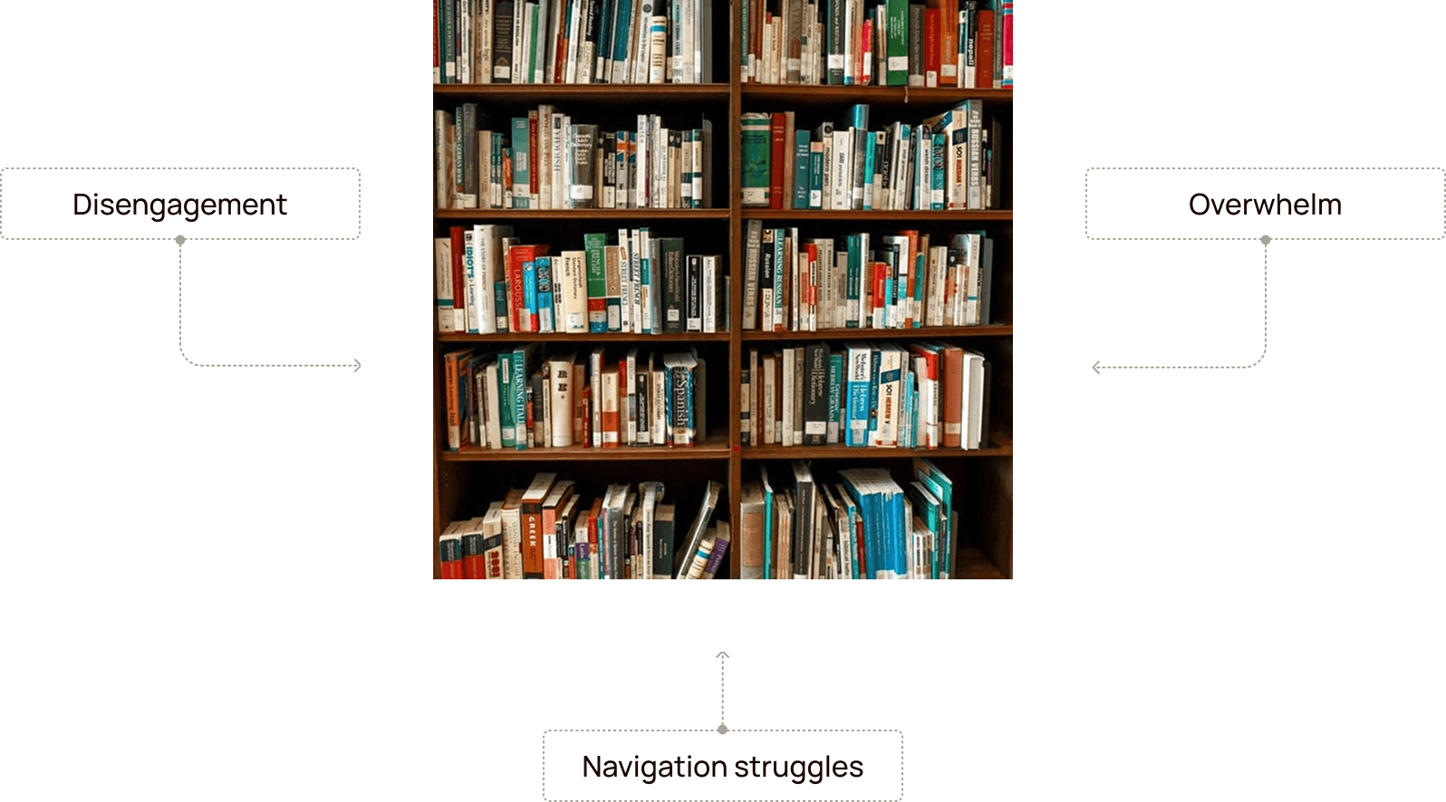
Information overload
more content ≠ more learning
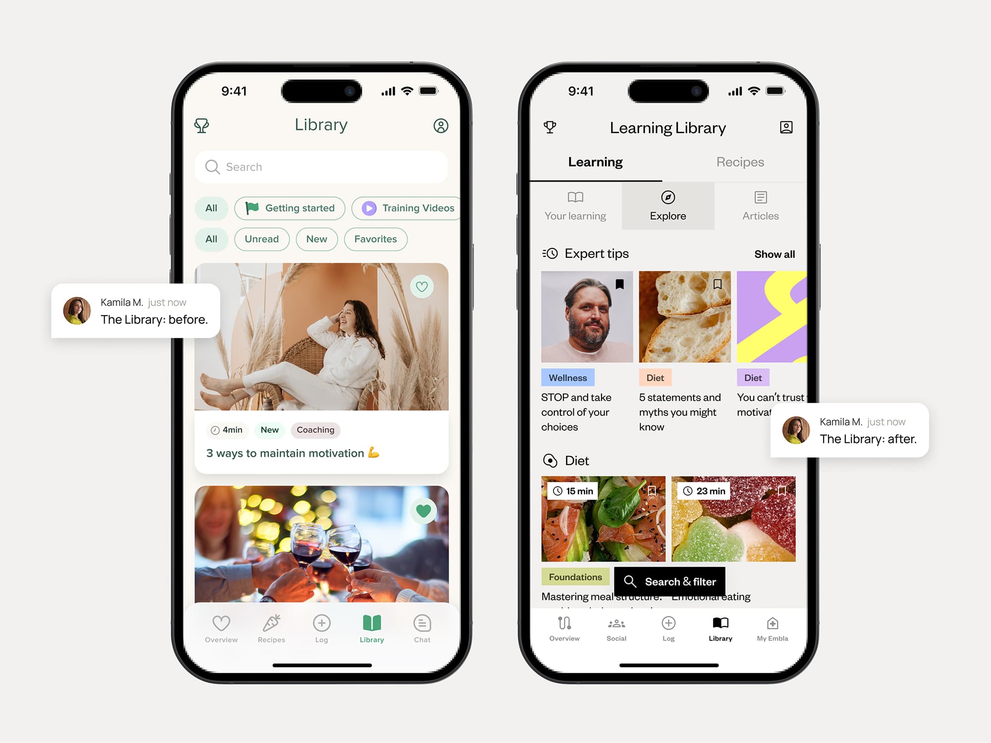
While the app offered a variety of learning articles, users mentioned feeling overwhelmed by lengthy, unstructured content. This lack of clarity and personalization led to disengagement, with many members skipping over valuable learning opportunities altogether.
On the back end, the core health coaching service was disconnected from the app’s learning resources. The content had to be tailored to different languages and locales, while creating, managing, and assigning learning materials was not straightforward.
The process
02
Defining the path
(and the MVP)
Given the strict (and vital) health data confidentiality, we couldn't just pull users aside for endless chats. So, we had to get creative.We leaned heavily on qualitative interviews with the expert health coaches, who have invaluable frontline experience understanding member struggles.
We also ran usability tests on existing flows to pinpoint specific navigation issues and identify where the content guidance felt unclear or just fell flat.
Piecing these indirect insights together painted a clearer picture: users definitely struggled with navigation and lacked clear guidance.
But before diving straight into solutions based only on internal insights, we also took a pragmatic peek at competitor platforms (working with the PM). Seeing how others tackled learning content provided useful context, some inspiration, and occasionally, clear examples of what not to do.

To make sense of all the research, we used affinity mapping to find patterns, then worked closely with the PM on feature prioritization. This was crucial for pragmatically defining the MVP – sorting essential 'must-haves' from 'nice-to-haves' we could park for later. (You can't build the entire universe in V1, right?).
The user testing
03
Reality check
feedback = fuel
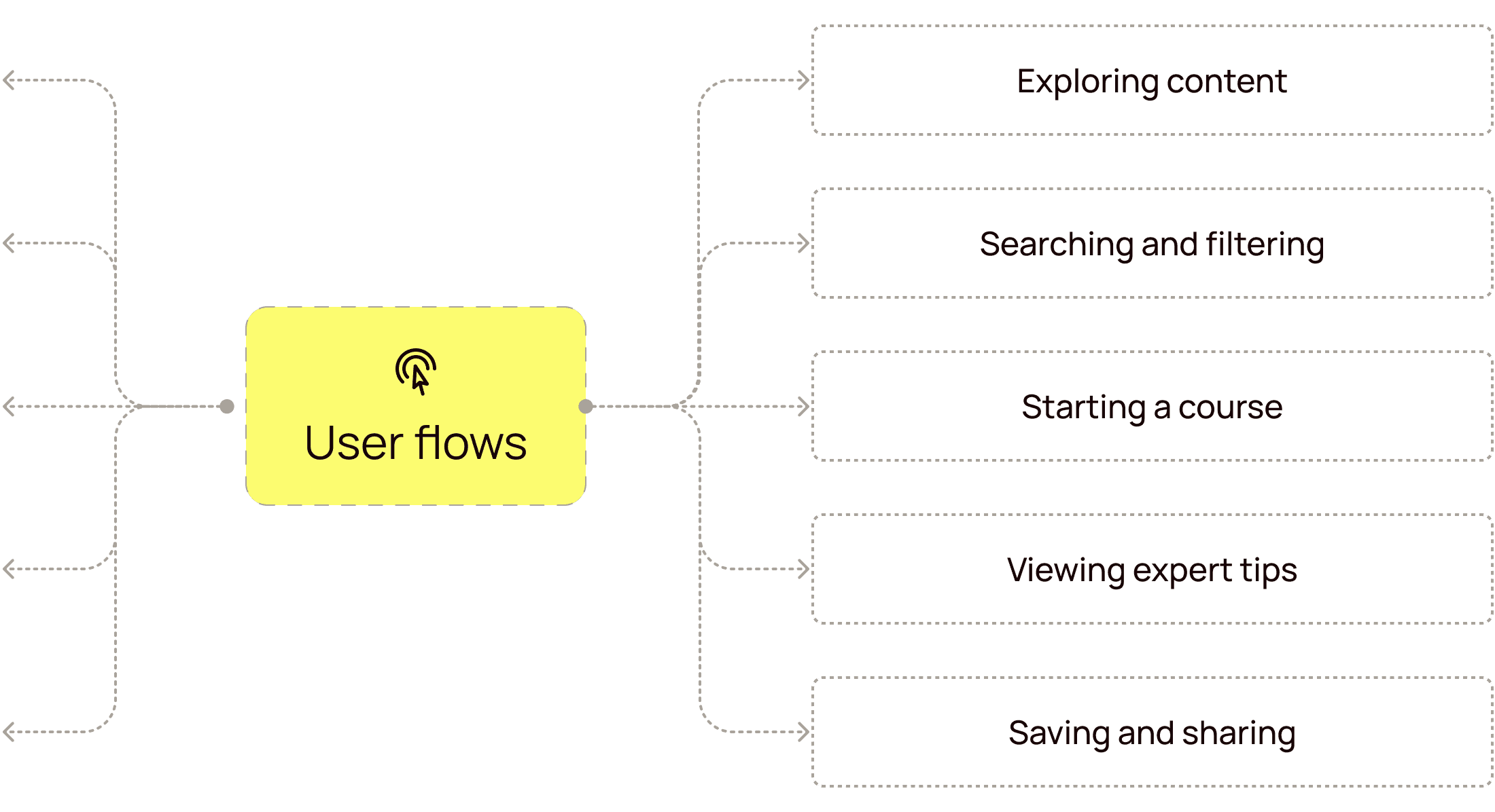
Mapping user flows focused on simplifying content discovery and learning assignments. The wireframes focused on clean navigation and ease-of-use features, supporting members on their wellness journey.
We got positive nods on the simplified navigation and course structure – a good sign we were heading in the right direction! More importantly, the feedback provided super valuable insights into what needed refining after this initial MVP launch. Things like...
The solution
04
Less frustration ahead
the *actually*
tailored experience

Kamila M.
note
The personalized learning focus feature was added in a personal post-MVP iteration.
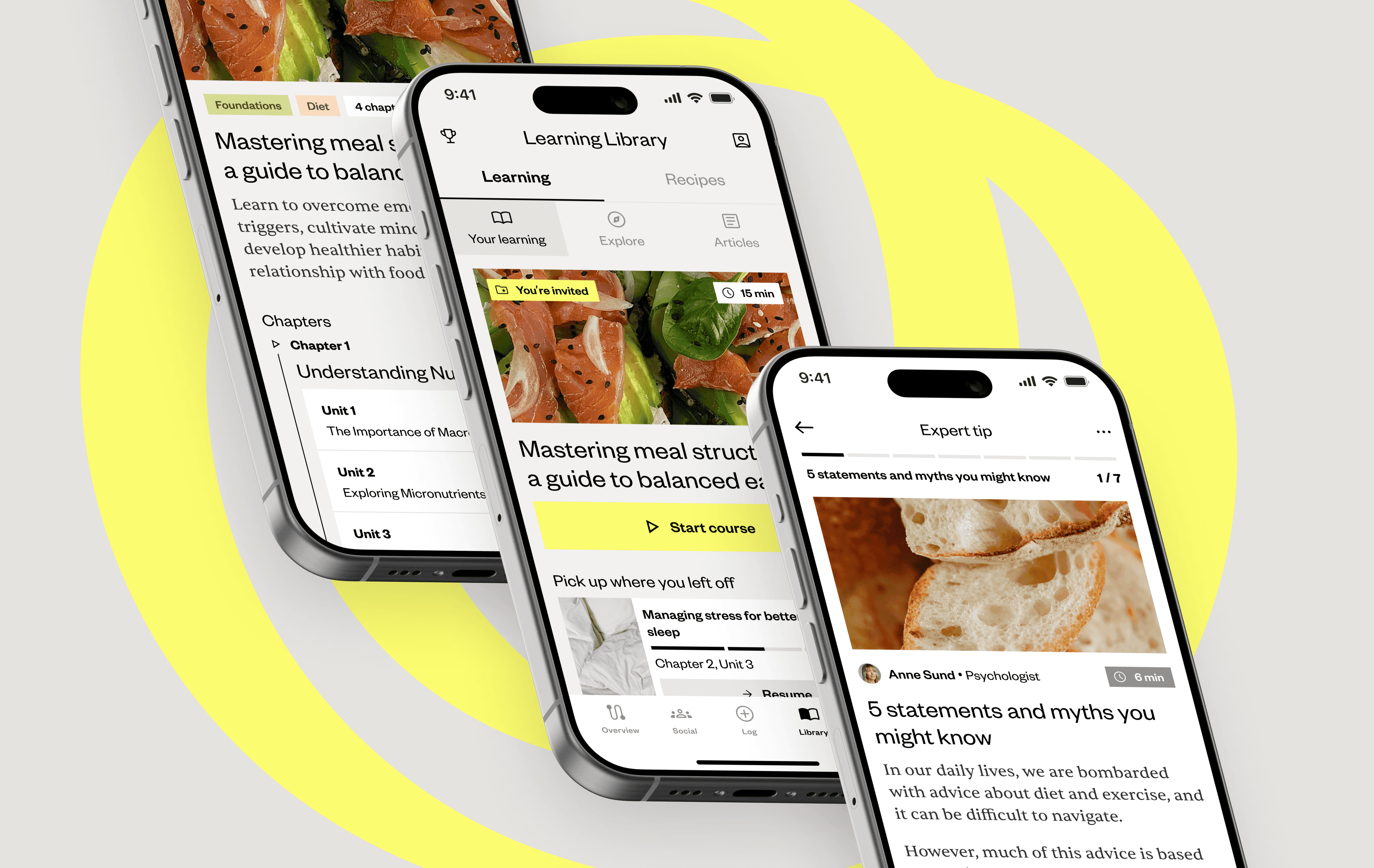
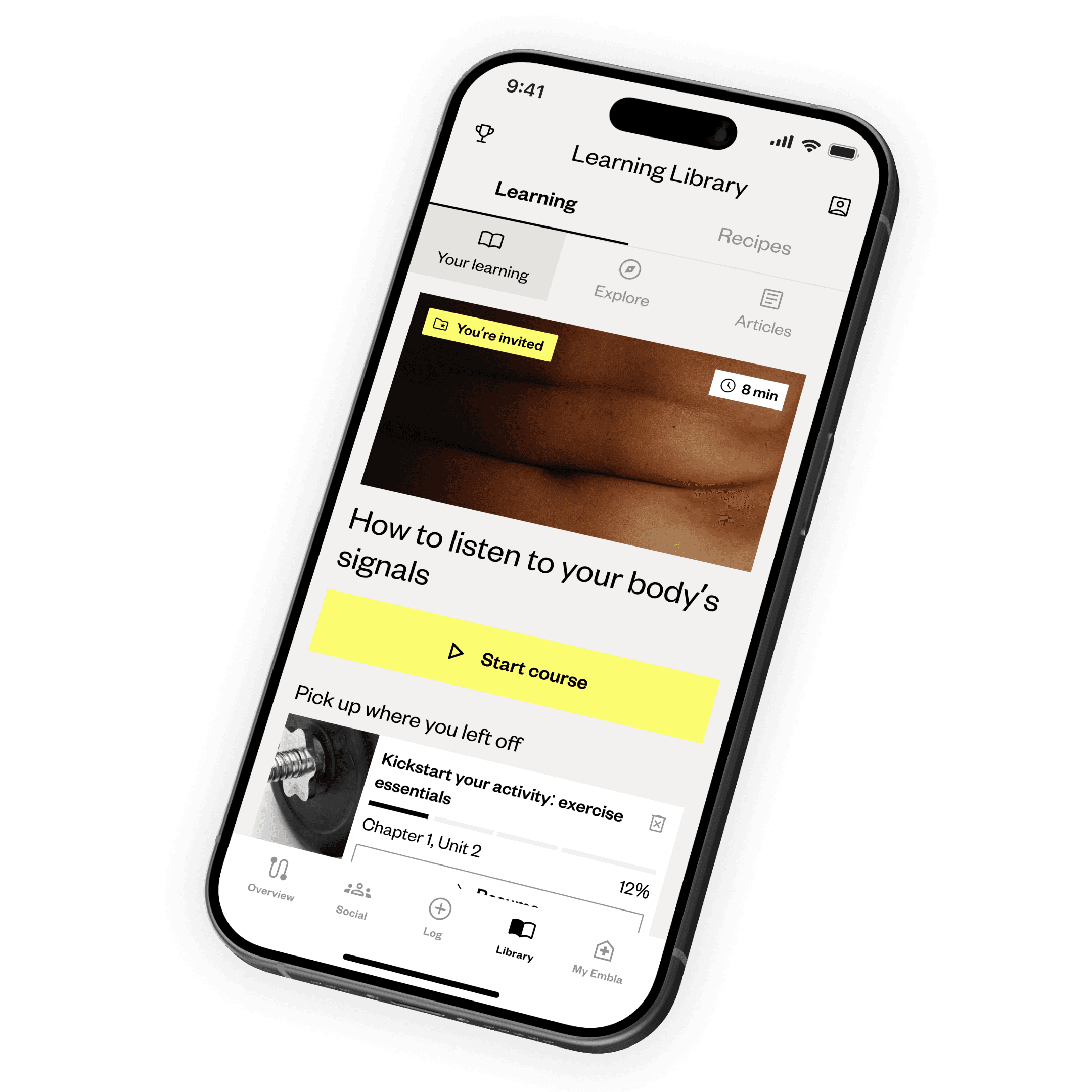
This meant building less of a static library and more of a responsive learning ecosystem – structured, yet able to adapt like a living thing to different user needs and journeys.
01
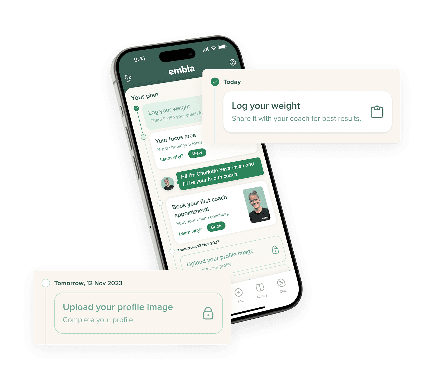
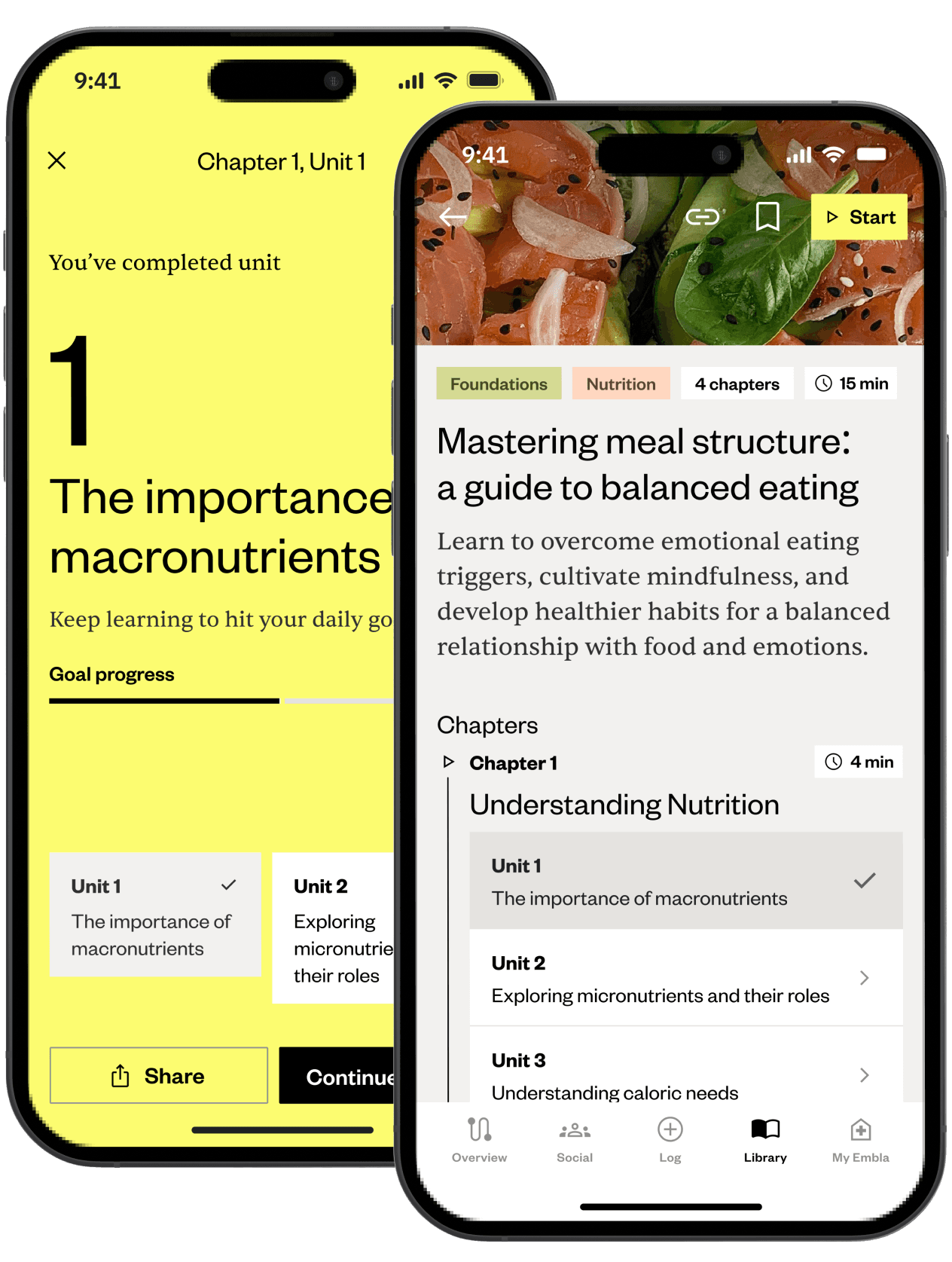
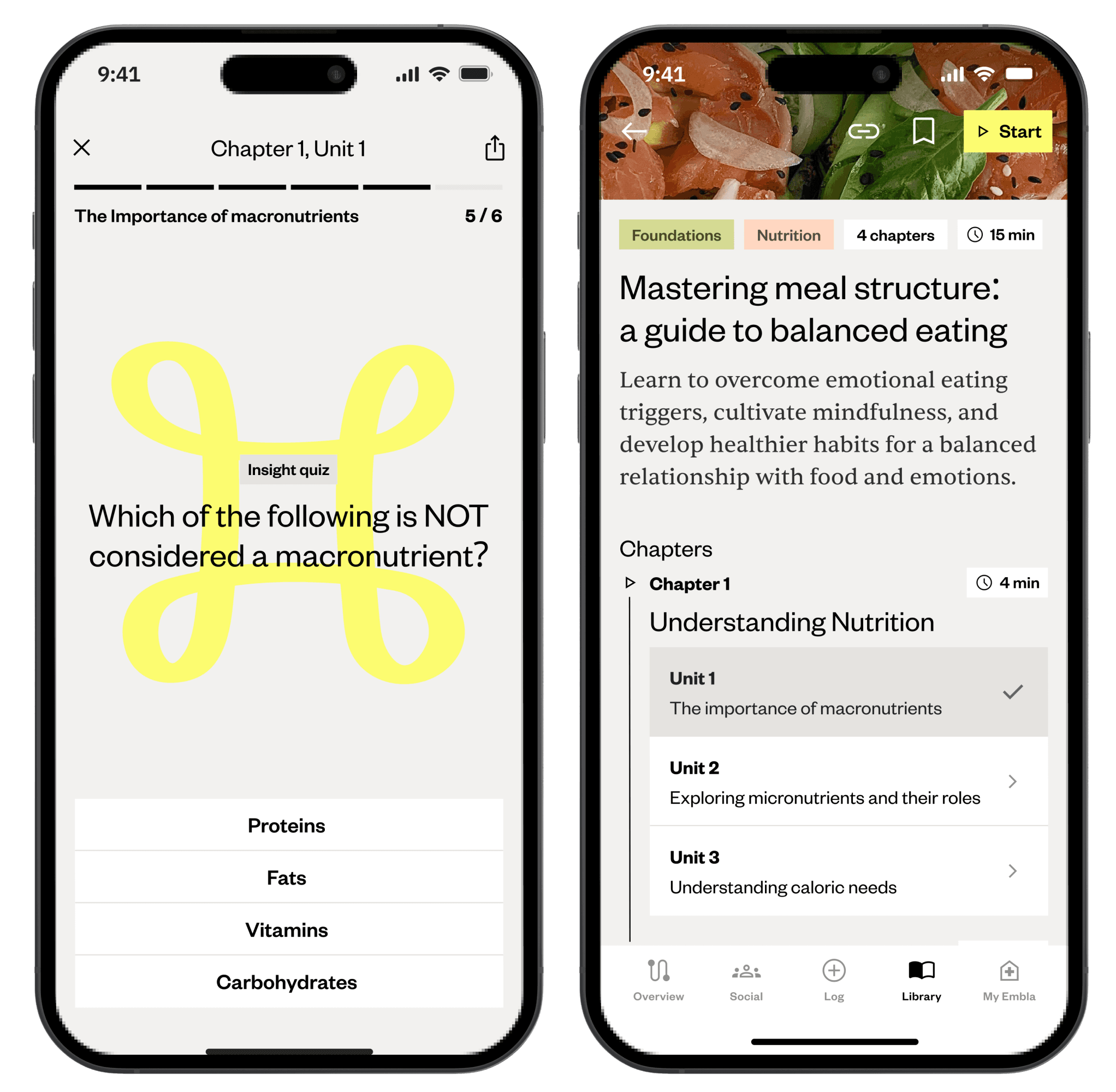
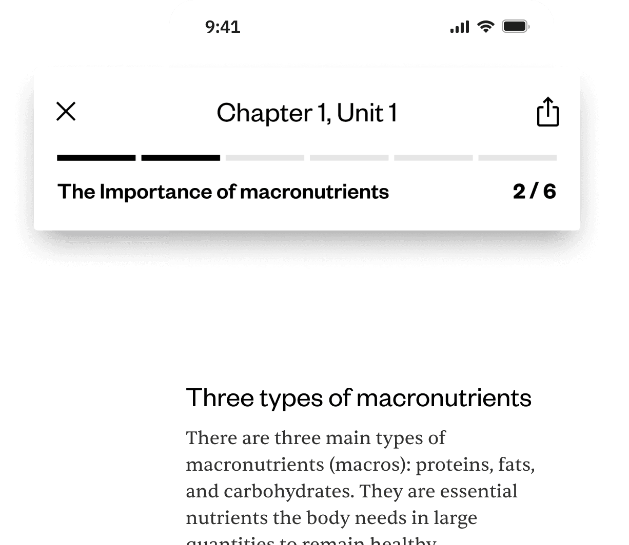
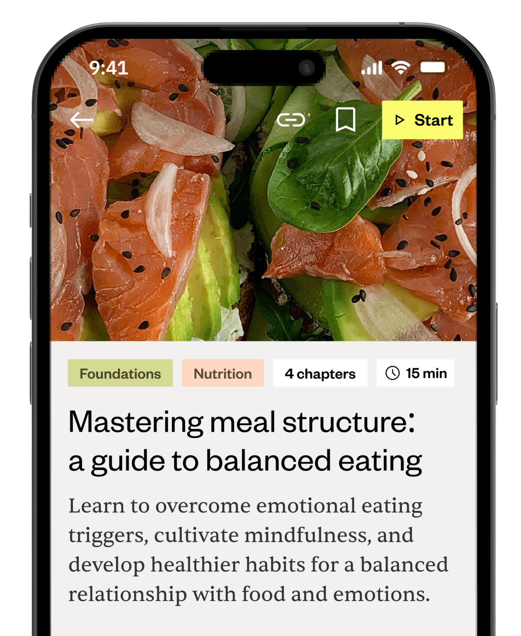
For those feeling overwhelmed or seeking structure: The core of the solution is the guided path. Often initiated by coach invitations, it ensures users see relevant content directly aligned with their personal goals and current progress stage. No more guessing what to read next or feeling lost in a sea of information! We also made sure localized content was easy to access.


02
To keep motivation going: We knew just having a path wasn't enough. We integrated clear progress tracking within the learning modules and added interactive elements like reflection quizzes. Seeing tangible progress and getting that little dopamine hit of accomplishment is crucial, especially when working towards long-term health goals.

03
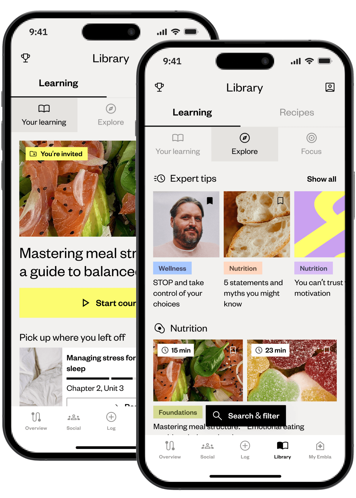
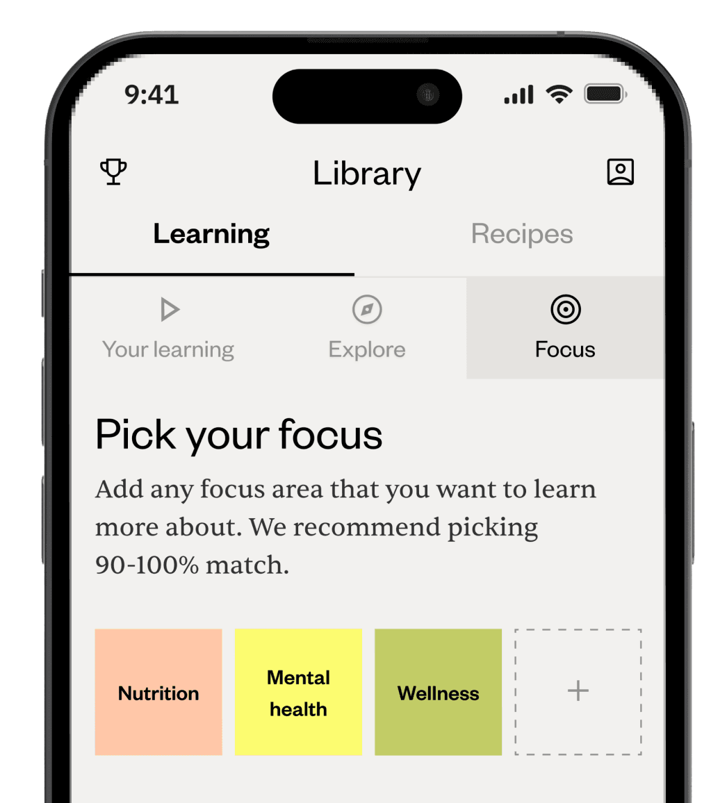
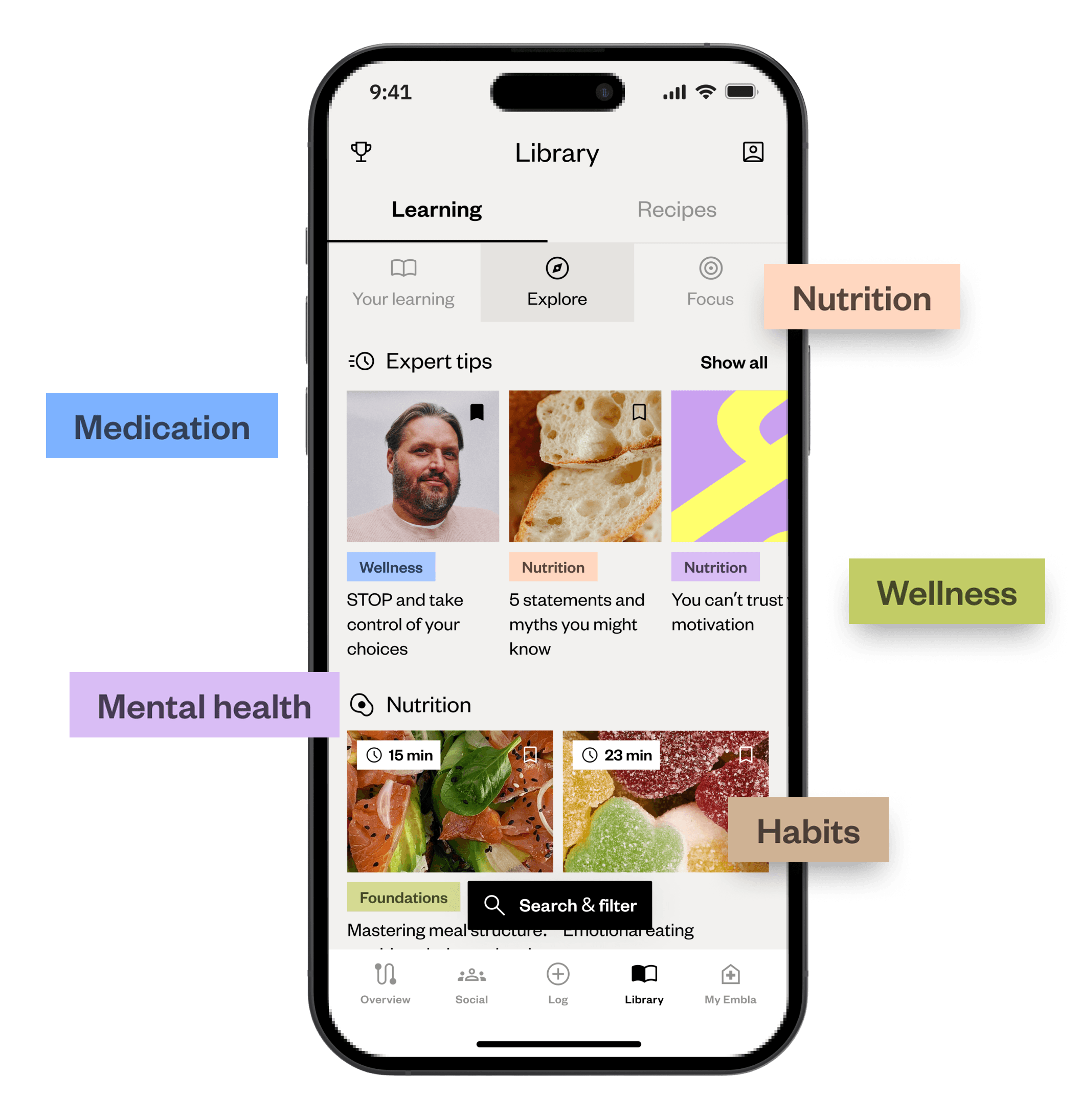
And for the explorers and curators: We didn't want to force everyone down a single path. For users who prefer self-discovery, we included a dedicated library tab with much improved searching and filtering. We also added features for saving, sharing, and managing favorite articles or tips, giving users a sense of control and letting them build their own personal knowledge base. Deep linking between related articles also encourages further, self-directed exploration.


The results
03
The takeaway
(and potential
discovered)
Full transparency here: I moved on from Embla not long after the Learning Library launched with its initial content, so I don't have those juicy long-term metrics or graphs to show you. (A shame, I know.)
However, the initial qualitative feedback was definitely encouraging. It highlighted the potential of building this kind of adaptable, personalized learning framework early on. While its ultimate, long-term success naturally depends on growing the content library and ongoing engagement strategies, the foundation felt solid.

Content and structure symbiosis
It's not just what you teach, but how you structure it. Making the learning material modular and actionable, presented in a way that matched users' mental models, clearly resonated more than just walls of text.

Integration creates cohesion
Tying the learning experience smoothly into the core coaching service wasn't just a nice extra – it significantly boosted relevance and usability. When different parts of a product talk to each other effectively, users feel it.

Anticipate and address friction
Proactively mapping user flows for things like saving content, and then actually designing to reduce those little frustrations (less cognitive load!), makes a tangible difference to user satisfaction. Don't ignore the small stuff.