The challenge
01
Making sense of the mess
(Flexibility
was key)
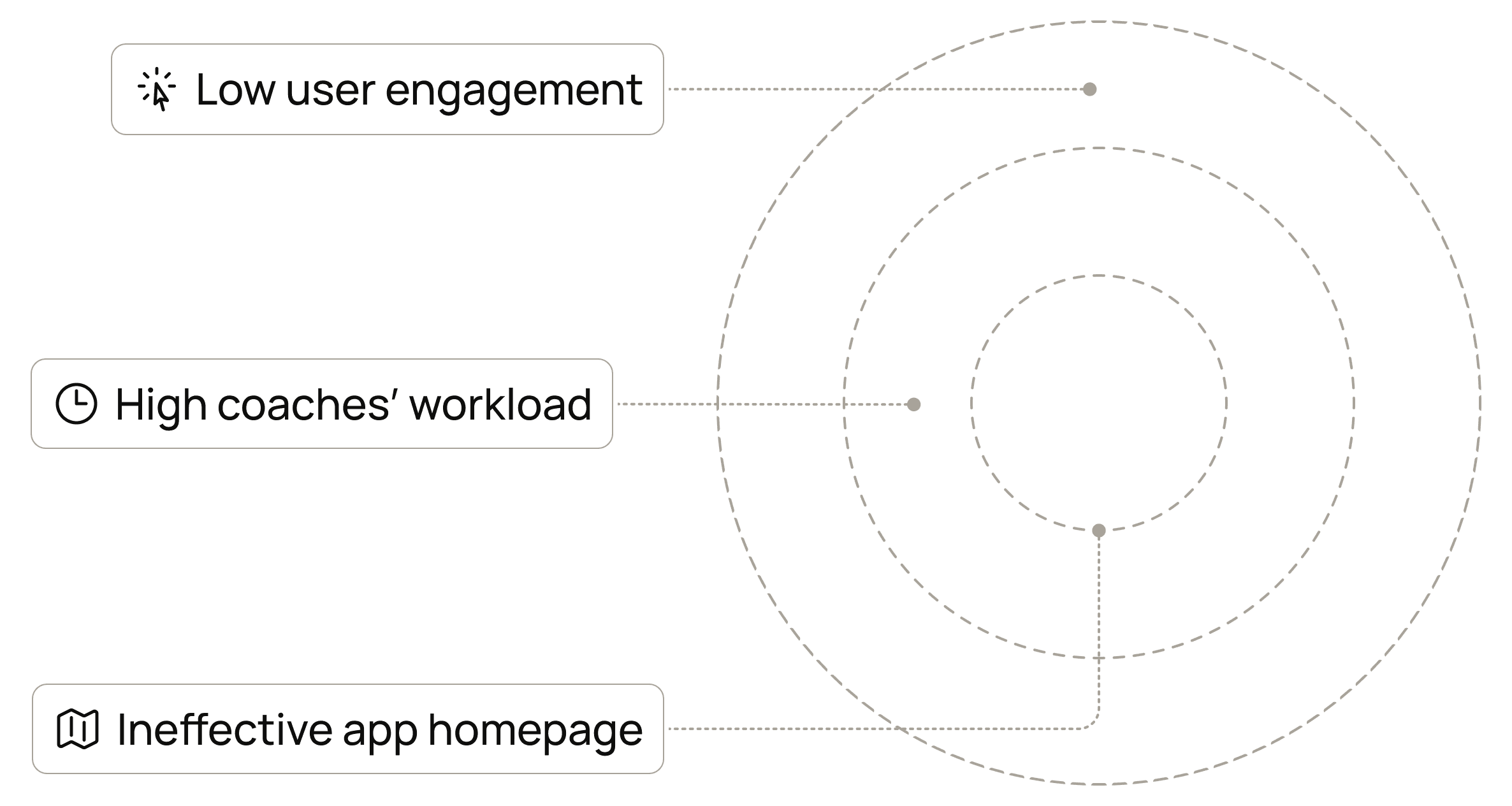
Embla’s app users struggled to navigate static content and features, making it difficult to stay motivated in their weight management journey. The brilliant health coaches were burning out trying to manually re-engage and guide everyone.
The objective became crafting a smoother experience that would genuinely engage users and lighten the load for the coaches.
The process
02
The path to clarity
(Non-linear,
obviously)
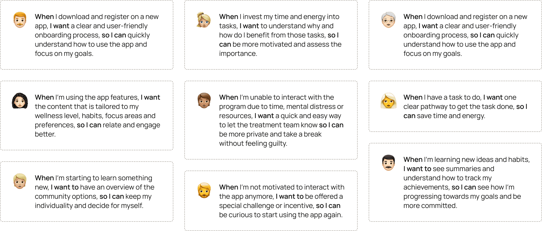
Step one is usually talking directly to lots of users, but strict health data privacy rules (a must) limited direct user access. This meant finding another way of gathering my insights.
We had to work smarter, piecing together the picture primarily from the invaluable insights of the health coaches and analysing anonymized usage patterns to figure out why engagement was flatlining.
The process
03
Mapping and strategy
(Logic applied)
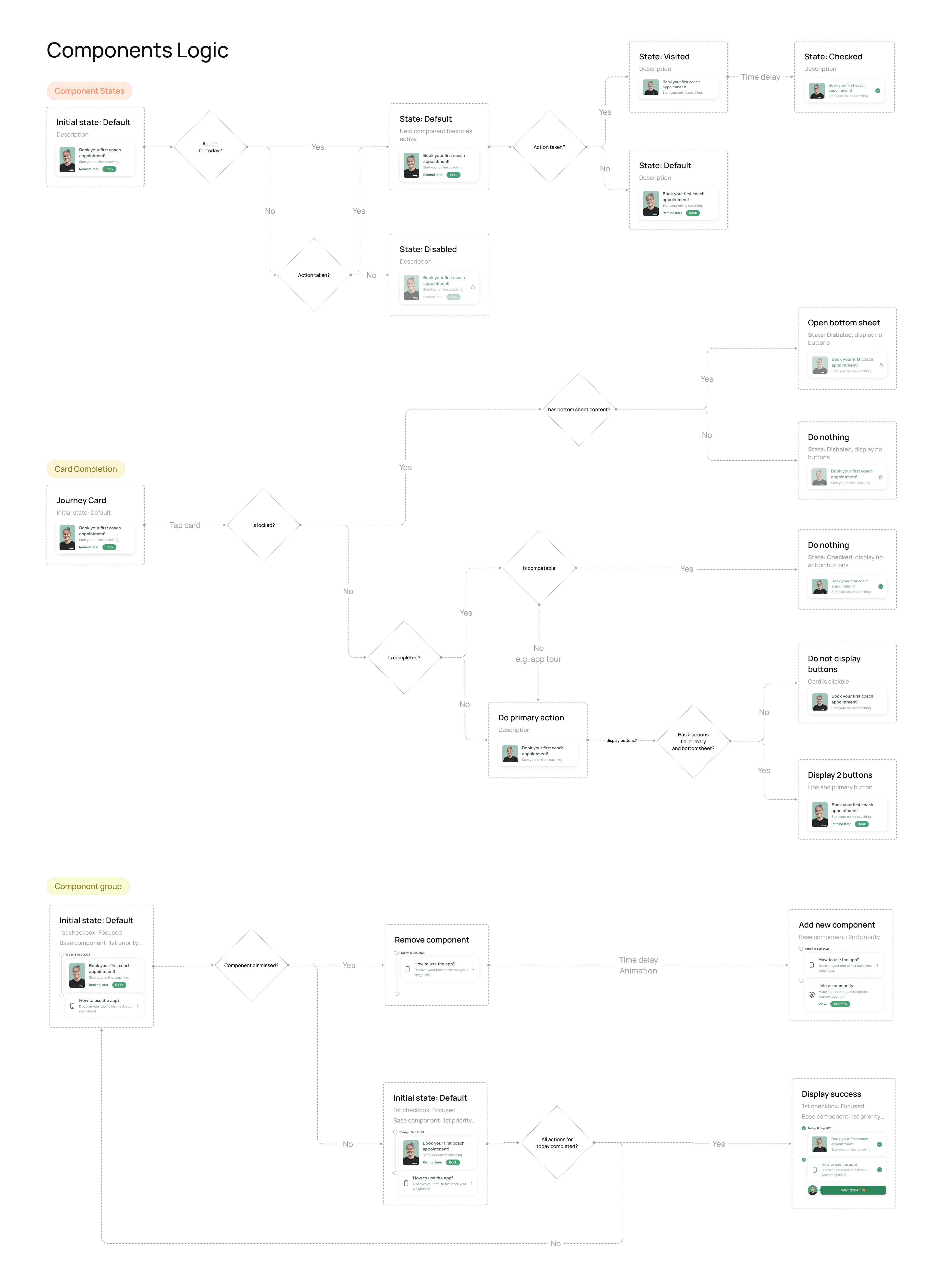
Mapping out the user journey clearly showed us where people were getting stuck or just plain confused, highlighting exactly why the app needed that personalized, interactive timeline – something much more helpful than a boring old checklist.
But just having a timeline wasn't enough. This is where the psychology insights came in handy. Knowing that building habits thrives on clear feedback loops and a sense of progress (thanks, behavioural science), we deliberately designed the timeline to feel actively rewarding and forward-looking. The goal wasn't just to record the past, but to genuinely guide and motivate users on their path forward.

The concept
04
Built to last (hopefully)
Low-fi first.

Lots of sketching and iterating on a modular feed of action cards, to accommodate Embla's personalized coaching programs and the diverse needs of its members. I designed the homepage to have a flexible and expandable structure.

It's relevant.
Engaging and appropriate for users with varying goals, focus areas and preferences.
It's coherent.
Ensuring scalability and future-proofing the design, as Embla expands its features.
The solution
05
Where we landed (mostly)
(Version 1.0,
at least)
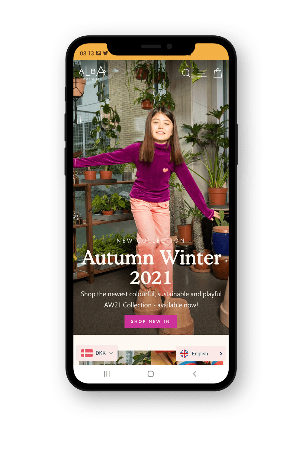
A redesigned homepage that finally felt like a useful, personal dashboard – putting key info and clear next steps front-and-centre, not just a jumble of features.
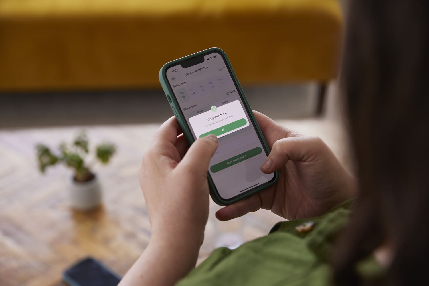
The real star of the show, though, was the new interactive timeline. Instead of just being a look-back log, this became a dynamic guide. It showed upcoming coaching sessions, relevant learning modules, milestones hit, and crucially, what to focus on next (no more relying on memory).
A key part of making this work was smarter interactivity designed to reduce that 'information overwhelm' we uncovered. The content and calls-to-action shown weren't static; they changed depending on the user's specific stage – focusing on onboarding support early on, then naturally highlighting relevant features or subscription benefits later.
We also built in feedback based on what users did in the app, aiming to constrain choices logically and guide their focus only to what was most relevant right now. This helped tackle that "no clear path" problem, making the next step feel more obvious.


Personal exploration
04
Iteration in action
Second
(better) thoughts.

But how can we not overpromise results during such a vulnerable process and focus on holistic progress instead?
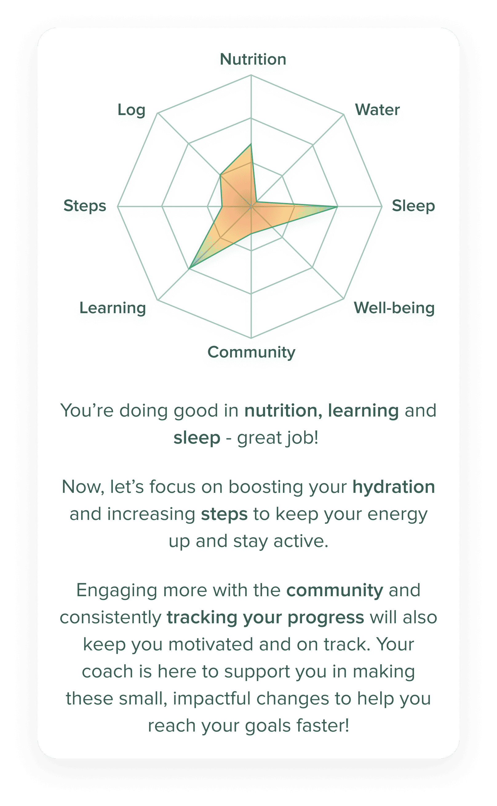
An initial concept considered was a 'Weight Loss Forecast,' predicting trends, perhaps comparing progress. But I realised that focusing too heavily on weight could easily overshadow the importance of building sustainable habits (sleep, nutrition, activity etc.) and likely cause user frustration. That approach didn't align with truly humane design principles.
This led me to pivot towards the Progress Map concept shown here. Using a radar chart provides a more balanced, holistic view of a user's effort across multiple lifestyle areas. This felt like a better way to offer clarity and motivation, respecting user emotions and focusing attention on the journey and positive habits, not just the number on the scale.

The results
03
So, did it actually work?
(always more to learn)
The good news? It seems so. Giving users that clearer, more personal view of their journey really resonated. Early feedback and available metrics pointed to a noticeable uptick in engagement with the new timeline and key homepage areas.
Beyond just 'shipping features,' we also worked closely with the product manager to tie our metrics back to broader OKRs. The focus deliberately shifted from just activity to actual results.
127%
Rise in first-time appointment bookings with average time to book the first appointment dropping by 47.5%.
11.2%
Rise in the average frequency of recorded measurements per user.
54%
The adoption rate of members engaging with the "My Journey" feature.
104%
Increase in average frequency per user of attended appointments.